Louisa Giffard

Wood engraving – a new finer art

At the end of last year I had the opportunity to finally learn a skill I’ve been wanting to learn for a very long time – the art of wood engraving. I’ve worked with woodcuts for over 7 years and I love the diversity of mark you can create – from the finest curling line to the crudest gouge, and how the wood can be smooth and forgiving, or full of grain and line and detail.

Wood engraving is different. The marks are smaller, finer, the works often impossibly intricate, printed on very hard wood so fine and dense that even the tiniest scratch or impression will show in the final print. I was excited to see how my style of mark making would translate into this new medium.

The wood engraving class I attended was at Megalo, a Canberra-region print studio I am a member of, taught by Canberra region printmaking artist Peter McLean . I would like to make a general statement about how wonderful it is to be part of a network of other artists. Printmaking can be a very collaborative, supportive medium, requiring artists to share space and communicate with each other. I have always found printmakers to be wonderful people, generous with their time, and I am proud to count myself amongst their number.
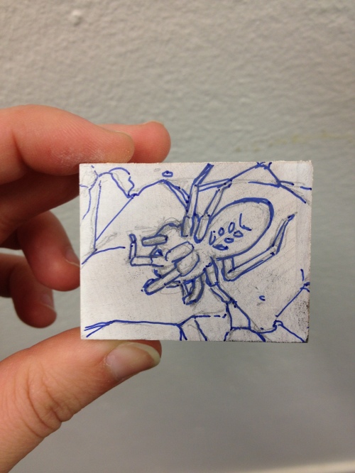
IMG_7839

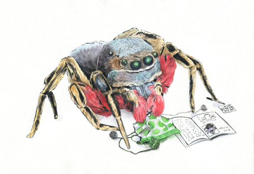
We worked with very small maple end-grain blocks, carefully sanding them, coating them in white gouache and drawing an image on them as a guide for our cut lines. For my first engraving I choose to draw a spider. spider engraving
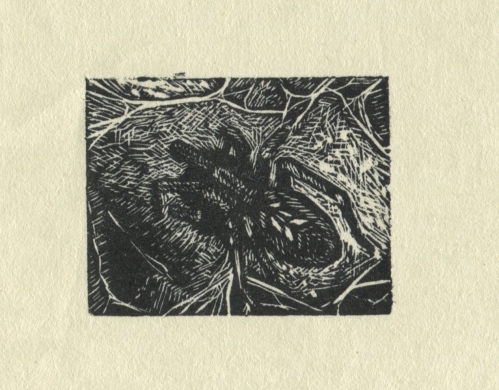
The spider, printed.

IMG_7847

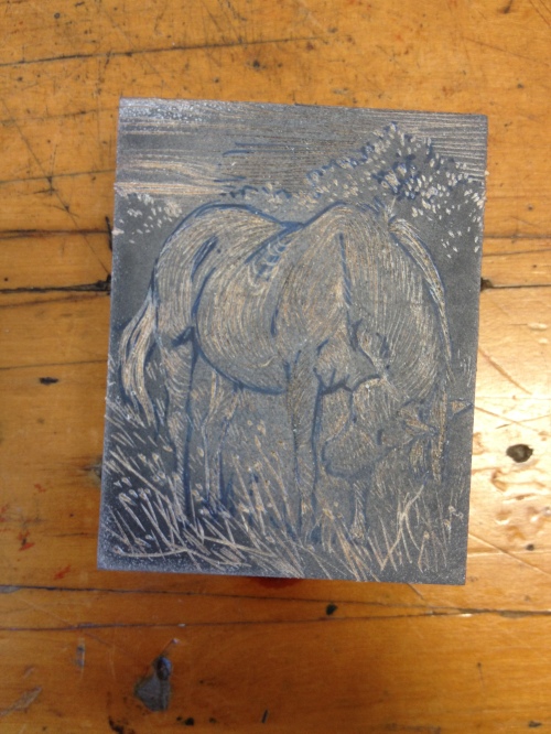
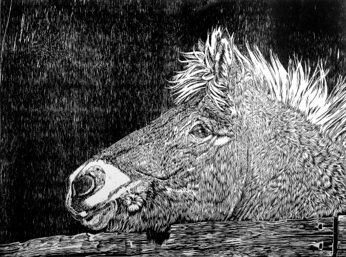
The finest lines would print. Here is my second image – Arabell from Horse and Art 
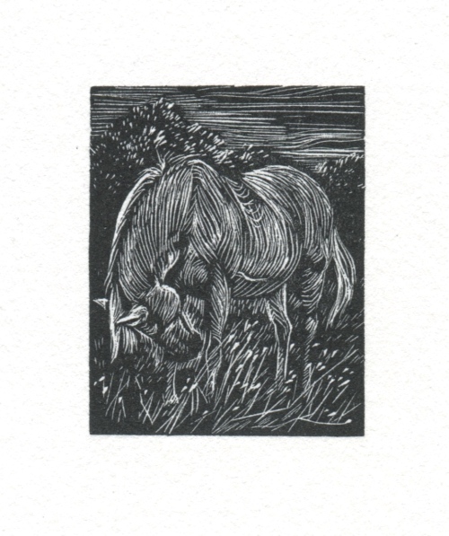
horse engraving

This tiny image is 3.7 by 4.7 cm.

My final image was of a barnacle goose, from my trip to Finland in August 2017. Goose engraving
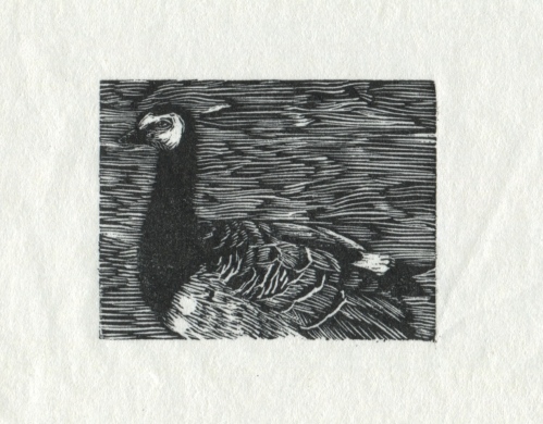
I carved this image faster than I did with the spider and the horse, so I’m not as happy with the result. However, I am extremely happy with the overall effect of wood engraving, and am looking forward to getting some tools of my own to continue the practice. Small scale works have a lot of advantages, especially if you’re travelling for residencies or have to worry about storing your work, and wood engravings are tiny, intricate and perfect.

Horse and Art 2017

I’ve just been in Europe for 5 weeks! While there, I attended a wonderful, unusual artist’s residency called Horse and Art.

The two program was in a tiny town called Barnag, in rural Hungary, and it emphasised the connection between equestrian arts and visual arts. I got a chance to use my Hungarian language skills, my printmaking skills, and to have a lot of fun working with horses for the first time in my life, having interactions with these beautiful animals that were a far cry from the four standard 2 hour trail rides I’d done in the past.

As a consequence, I did a lot of art. Of horses.

IMG_7371

Depicting horses is something I used to do significantly more in the past, before my practice switched to one based more on my own personal observation. I love horses and I love depicting them, but I think I became a little bit worried over the years about avoiding cliche, because horses can be a very cliched subject – think of the painting of the dramatic rearing steed, a herd of galloping horses, or the beautiful pony with flowers in his mane. So I admit that I was a little anxious to resume depicting horses in my work.

I decided to spend time with them, to observe the movement of their bodies, the way the light shone off their coats, the way they moved, the shiver of their muscles and the angles of their moving legs and heads. I created works based on their shifting, contorting bodies.

IMG_5777

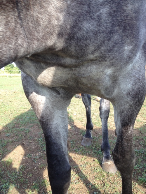
Zselyke’s chest and legs

Zselyke

Zselyke in print

arabell

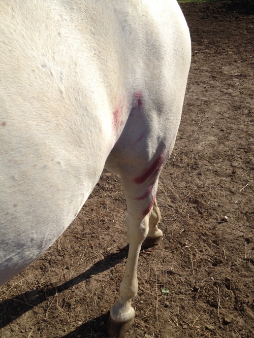
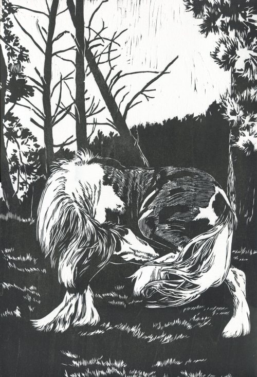
Arabell dealing with an itch

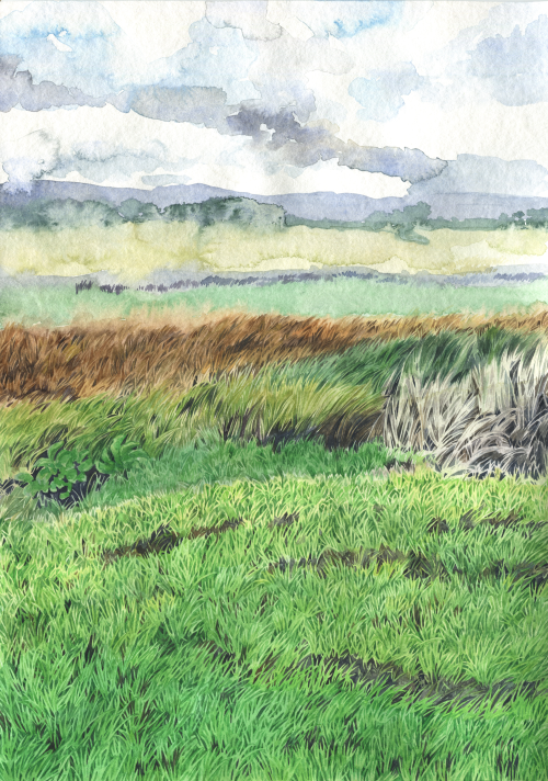
I also did a lot of work to do with the environment. Barnag is a beautiful place, rolling fields and spectacular skies, covered in wildflowers, thyme, herbs, and berries. IMG_6555IMG_5781IMG_5898

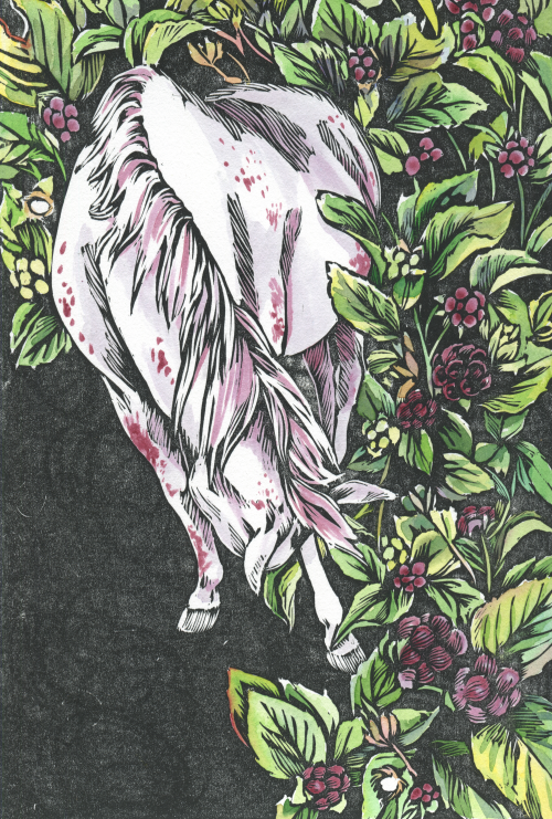
One of the horses, Arabell, would roll in the field and get covered in stains from the dewberries and blackberries. I was intrigued by the berries, and so I did several works based on Arabell’s interaction with them.

IMG_5783

The horse herself

arabellberries

An intaglio print, coloured with berries

arabellblackberriesbw

Woodcut

arabell and blackberriessmall

hand-coloured version of the same woodcut

yellowberriessketch

Small sketch

I also did some other works involving berries, depicting the other horses.

Finally, something non-horse related. A painting of some of the wonderful wildflowers, following on from my wildflower painting I did in Canada. I did this in a much looser style than I usually work, emphasising the ephemeral nature of these abundant plants.

munka3

Painting from life

hungarianflowerssmall

A bouquet of wildflowers and weeds

It was half the length of my previous residency, but it was a very busy, involved time. I met some wonderful people and had some wonderful interactions with the horses. This is a beautiful part of the world – the Hungarians value horses very much, having a history of equestrian skill going right back to the Huns, and the hosts, Beáta and Marton, have wonderful responsive horses whom they work with in a very natural way (lots of bareback riding, significantly less tack than most other equestrian disciplines.) It didn’t matter that I hadn’t had the experience with horses the other residents had had – I was given the opportunity to learn at the pace I was capable of. Now that I’m back in Australia I’d really like to continue riding, although I’m not sure how yet, given that I don’t have a horse or access to a horse!

Redbubble, Spoonflower, and other forms of accessible art!

I’m really happy to belatedly announce that I now have a Redbubble store!

I’ve had people asking about purchasing prints of my art for a very long time, and I finally got around to creating a Redbubble store! Primarily I was intending to sell prints, especially to international customers (as Redbubble handles the shipping, rather than having to handle exorbitant shipping fees myself) but then I realised the other possibilities for my work. .

Many of the works I’ve previously posted online are available on Redbubble, but I’ve also created a new series of works specially for sale. Here are just some of them.

knittingspidersmall

I catered to Twitter’s arachnophiles and spider scientists with this cute little knitting spider!

windflowerfinalsmall

Repeating pattern of Japanese windflowers, drawn in highlighter

I began experimenting with creating repeating patterns in traditional media. To be honest, it’s such an arduous process that I’m not sure I should continue, but the effects are so wonderful that I might do more.

galliformesmergedfinalsmall

Galliformes

capercaillie

Capercaillie

cloudberrynbg

Cloudberry

There will be more things available on my Redbubble periodically! If you like my art I encourage you to check it out.

The Darkness Torch

If you like the works in this post, they’re available as prints at my new Redbubble store! I’ll do a further post about the launch of my Redbubble next, and more information will be there.

Hello there. It sure has been a long time since I posted.

This year I had an exhibition in May/June, called The Darkness Torch. The theme was an exploration of the differences between working in additive media, and in subtractive media (dark to light vs light to dark, the differences between painting and woodcuts.)

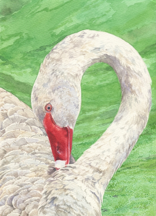
When searching for ideas, I suddenly thought of a pink raven – and how the idea of a raven is so linked to its colour. Would the same bird be recognisable in a different coat of feathers? pinkravensmall

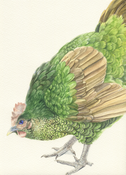
I expanded this into a small series of familiar birds in unexpected colours

black gull small

Black Gull

white black swansmall

White Black Swan

Bower hen small

Bower Hen

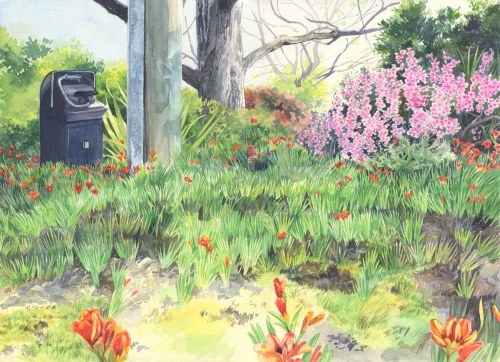
Next came a few landscape paintings.

scene with no black small

Scene with No Black

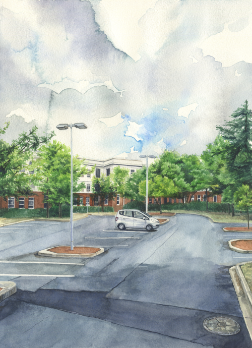
cityforcarssmall

City for Cars

This scene was inspired by a day when I went to go and see a small architecture exhibition at the National Archives. I took a wrong turn and parked my car at the West Block, instead of the East Block. The carpark was deserted, and it got me thinking – how often is a carpark deserted, except for your own car? My Honda Jazz looked so strange and melancholy, alone in the middle of a city designed for cars.

SouthSmall

South

This near-abstraction of a landscape almost killed me to paint.

Also included in the exhibition were some woodcuts I’d created. Two depict horses, as they were pieces created to apply for a horse-themed residency. I’ve always really liked horses, but I turned away from depicting them for several years, as my practice changed to one based more on personal observation and I don’t really have much access to horses. Therefore, I decided I needed to create some more recent horse-based works, to demonstrate that I have an interested in horses in art.
(I got the residency placement by the way, next post will be about my time there.)

2

Horsebeast

1

Winter Coat

The first of these was done on a wood plate, the second on a piece of plywood. Both have very different textures, and the line created by the chisel works very differently on each one.

Finally, I created a botanical motif based on my walks around the neighbourhood, seeing signs for fuel-reduction burns tethered to plants in the bushland.

prescribedburnredsmall

This exhibition was the largest I’ve done yet, and the effect of the works on the walls ended up being absolutely wonderful. However, creating the works took a lot out of me, which is why I seem to have fallen off from updating this site a bit. It’s been a rather busy year, and I’m trying to get back into it.

Thanks again,

Louisa

Last night I dreamt I went to Ash Park again

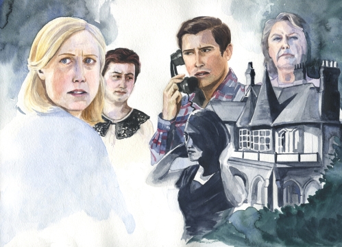
titlecardyTitle card for the gloriously over-the-top but still genuinely effectively TV show A Place To Call Home. Bought to you by PAYNE’S GREY, apparently.
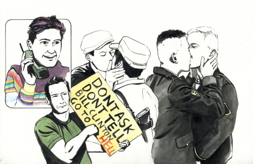
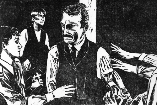
I attempted a homage to film posters from the 40s and 50s, and was of course reminded of Rebecca. The looming, huge house (a real place, called Camelot in real life, Ash Park in the show) brought to mind Manderley.

Above Ash Park, Elizabeth Bligh looms – the matriarch, the leader of the empire. Her worried grandson James serves to inherit, but feels anxious, unable to live up to family expectations – while underneath, the evil Regina lurks, undermining the whole Bligh dynasty. Meanwhile, Sarah and I are separate from the house – outsiders. Sarah, an outsider in the town; I, an observer of the show itself.

Title cards can be hard – I decided to use a new watercolour paper that came in a pad rather than a block. Not my preferred way of working – far more prone to buckling. My composition is also very off. I tend to forget the dimensions I need to make a good title card (significantly narrower, more of a 16.9 than a 4.3) so my work expanded to fit the paper. Oh well!


Dignityspect

Oh my, it’s been a long time since I put anything up here. New title card! This is for a review of DIGNITY AND RESPECT, a really official, dry and hateful comic about Don’t Ask Don’t Tell, the US policy about queer people being able to serve in the military. So of course I made the title card as gay as possible.

titlecard

Splendid!

Daniel

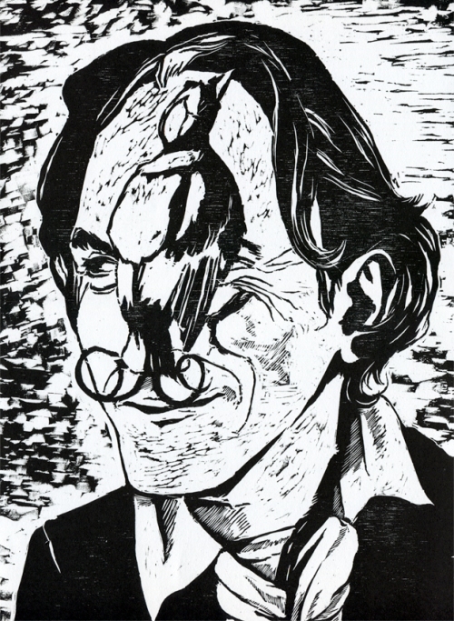
There Will Be Blood woodcut

A title card for Paul Thomas Anderson’s fantastic, grandiose 2007 movie There Will Be Blood. The film has a pretty incredible aesthetic. It’s so dramatic. I thought that if any film deserved to be a woodcut – that wonderful stark, expressive medium full of painstakingly hewn lines lines and yawning blacks- it was this one. God I love woodblocks!

I haven’t had much time on my hands lately, so while I managed to cut a block I didn’t have time to go to a print studio and print it properly, with a press. So this is printed with oil-based ink (appropriate for such an oily movie!) at home, using a baren and a spoon. I hope for a more even pressure and a denser black next time.

A final note: the first woodblock I ever did in my life was of Daniel Day-Lewis, featuring him with a Wilson’s bird of paradise.

(It’s a very rough block, but it’s literally the first one I ever did!)

Something about the man’s very expressive face makes him a great subject for woodcuts, and I’m amused that this is the second time I’ve depicted him in this medium. I’m also wishing that I had the time to do some larger blocks again – it’s a lot easier to depict the details of a face when the whole face is a4 size, rather than trying to chisel out a likeness of a person’s face less than 10 cm square.

Commercial sequel

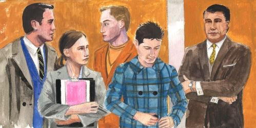
Another illustration for another episode on Mad Men!

It would have been easy to do the same kind of style as the last illustration, but I wanted to do something different. I attempted to imitate the style of Brian Sanders , especially the sketches he did on the set of 2001: A Space Odyssey. This was..surprisingly hard. I don’t naturally have such a casual style, and so I’m not entirely sure I managed to convey the same sort of sketchy 60s feel, but I’m pretty happy with what I got. Gouache, pencil and watercolour, and really rough (doing skin tones in gouache is just horrible, so I switched to watercolour.)

Mad Men - the lift

We’re all in the show’s infamous lift! Mad Men has several great lift scenes – one of which actually pays tribute to 2001, so…tangentially related I suppose.

And this is the last of my widescreen watercolour paper! I’ll have to find something else similar for my next title card – that pad was a great find, although for fine details it might be nice to have something with a smoother texture.

Commercial

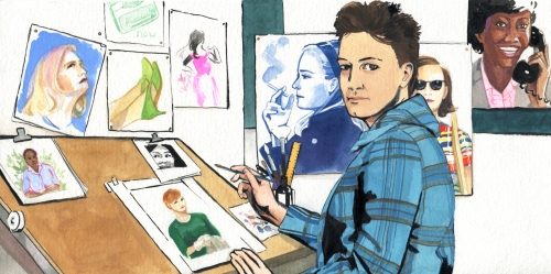
I’m currently doing two episodes on Mad Men, and the prospect terrified me. It’s a show rich in incredibly memorable and distinctive visuals – and how do you distil hundreds of hours of show into a single image?

I came up with a solution – paying homage to the world of commercial art at the time, and depicting myself as an illustrator at a creative agency. This particular episode focusses on Mad Men’s female characters, who are shown here as illustrations-within-the-illustration (I could have gone recursive with this! But that would have been far too much of a headache.) So here’s my attempt at mimicking the commercial styles at the time!

Mad Men: The Women

I hate gouache, but if you want something to look like a pre-digital commercial illustration, you pretty much have to use it. However, during the course of making this, I began to really appreciate gouache’s effects, once I adjusted to the fact that it dries darker, the reverse of watercolour, which dries lighter. You can get great uniform flat colours. It’s easy to lay down a swathe of colour very quickly. It dries quickly. It’s pretty consistent. I can see why it would have been used so frequently in commercial art.

All in all, doing this illustration was an absolutely delightful experience. It came together relatively quickly, and I was pretty happy with the effects I got and the general of-the-time mood that I was able to convey. I wasn’t sure I’d be able to effectively mimic some of the distinctive commercial art of the time, but using the right medium definitely helped.

Interior/Exterior

A whole new series of works!
Currently I have an exhibition on at M16 Artspace , called Interior/Exterior. These works explore the interaction between the outside world and the inside – how home can be a refuge, but also stifling, and how we try and integrate the natural world into our domestic lives.

Like my previous exhibition The Mysterious North, Interior/Exterior draws a lot from my observations from life. Unlike that exhibition, much of the imagery I worked with was very local and very domestic – my own house and yard. I’ve been resistant to depicting things in my life for so long, but now it seemed right to draw inspiration from what was so commonplace to me.

First, four paintings in watercolour and ink.

26 Suburban Species

A representative of every species of bird I’ve seen in my back yard

Encroach of the Horrible Ornamental Whatevers

A modernist house overwhelmed with the ornamental plants that plague my back yard

Sky Laundry

Dyeing transforms a domestic clothesline into something celestial

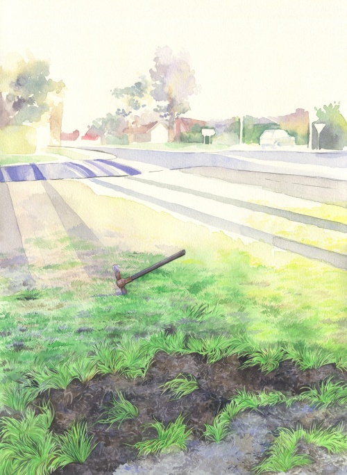
Rounding the Corner in the Evening

It’s quite something when you’re going for a walk, turn a corner and find a strange abandoned mattock. 

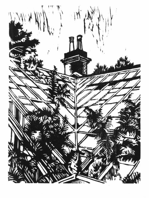
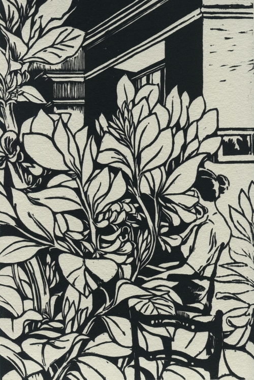
The next few images are woodcuts. Less a depiction of my surroundings, they explore the Victorian concept of Pteridomania, the desperate desire to collect and tame the outside world. In these works, people are engulfed by the plants they wish to tame.

Some of the woodblocks are in their original printed state, others are hand-coloured.

Bid for Freedom

Vicia Faba

Vicia Faba

Vicia Faba (uncoloured)

Vicia Faba (uncoloured)

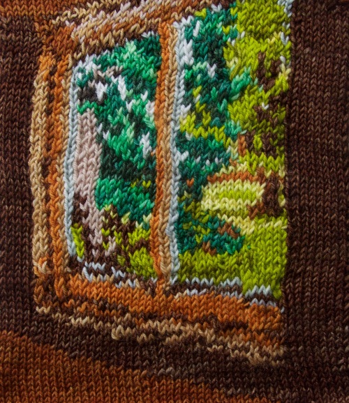
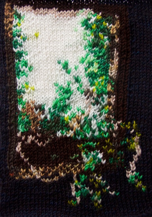
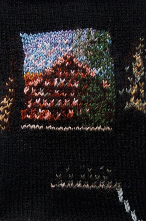
Finally, I experimented with knitted works. Using a combination of fair isle and intarsia techniques, I created charts and knitted three images – views through windows, depicting a desire to escape from the confinement of domestic tasks.

The Light Curls Around the Maples, Early Morning

An early morning view in Canada, capturing the brilliant golden glow of the sun upon the trees and fields outside

The Light Streamed Through the Ivy, Afternoon

Ivy bursts through the glass of a shed window, bringing with it the light and air from outside

Laundry View of a Condemned House, Evening

A view at dusk of a house condemned

This last piece has particular significance, as the house depicted is one of the houses due to be demolished under the Mr Fluffy asbestos scandal. The family has long-since left and the house lies dormant, waiting for its eventual destruction.

These knitted works were the most experimental of the exhibition. I’m not entirely sure whether I’d work like this again, but it was an interesting challenge trying to reduce an image to as few colours as possible – like particularly crude pixel art.

If you are in Canberra and you would like to see Interior/Exterior, it is on until the 15th of November 2015.