Louisa Giffard

Many changes

Well, it’s been a very long time since I updated the old blog. In the interim, many things have happened. I’ll gloss over the exhibition I had in 2022, and the wonderful Mokuhanga (Japanese woodblock printing) residency I attended in the same year. Ideally they should have had their own posts but it’s so long ago that it no longer feels timely. Perhaps I’ll put a bit of my work up from that time period, at least to fill in some gaps. Now, back to those things that happened, and why I haven’t blogged.

I moved to another country.

I now live in Finland, with my wife (who is Finnish. She also has her own blog!) Briefly put, it was easier for me to move than it was for her to come to Australia. Adjusting to life in a new country has its challenges of course, but it’s significantly better than living in a different country than the person you loved enough to want to marry and spend the rest of your life with!
I admit it took me a fair while to adjust to the move, which is not really a surprise, as an international move is a big stressor, no matter how excited you are about it and how positive you feel about your new home. There was a lot of paperwork, language barriers, adjustments to the weather, more household responsibilities, the need to worry about new things such as “is it so slippery outside today that I’m going to fall on my arse”, more paperwork, etc. Therefore, it was a while before I even picked up my pencils and did any art. You could describe this as having…

Art block.

Why, when painting and drawing and printmaking is such a big part of my life, did I find it so difficult to create? I didn’t do any art at all for the first six months that I was in Finland, and after that, it was still fairly intermittent. Why? I was consumed by the day-to-day adjustments to my life, which included learning a new (and fiendishly difficult) language, and didn’t seem to have the mental energy for drawing. But the most notable reason was that I was somehow anxious about creating work that was “good.”
Now, I am well aware that art is a practice as much as anything else, and like any practice, the best way to overcome indecision and anxiety is to create often, without worrying whether each work is going to achieve the perfection you see in your mind’s eye. I knew the solution to my art block was just to…do art. To draw sketches, without the expectation that I’d create a final work. But for some reason I still didn’t do this.
I had a mini flurry of activity in mid 2023, creating some work for Taidekieppi, an open studio weekend event in early autumn here in my area of Finland. I drew three drawings of Finnish birds.

White Wagtail, Fieldfare and Great Tit, all drawn in circles on coloured paper with paint pens
A great tit depicted in a circle, drawn with paint pens
Great Tit, drawn with paint pens
A White Wagtail, drawn with paint pens

And then I didn’t draw anything for a year.

In autumn of 2024, I realised I needed to push through the art block. Now, the thing is, I love drawing. I really enjoy the feeling of a piece coming together, and the sheer immersive fun of creating an image, whether it’s a sketch or a more complete work. So when I finally managed to force myself to just draw, without worrying about whether the work was going to be perfect, or exactly what I envisioned, I found myself creating pretty steadily, working on a drawing at least every other week. I realised that for some reason painting hasn’t been working out for me, and so I decided to just focus on drawing with paint pens and with alcohol markers. I love the colours and the immediacy of these media. I’d love to get back to painting (and printmaking) eventually but for the moment I’m very happy just drawing.

So here it is, the drawing that broke the drought! The one where I made myself just do it, and not worry about whether or not it was good. This drawing is of a nearby medical centre. I call it seven brothers, as the region that I’m in, Nurmijärvi, has as its coat of arms, seven identical male heads representing the Seven Brothers, characters from a 19th century novel by Nurmijärvi author Aleksis Kivi. (This is not to be confused with Seven Brides for Seven Brothers, which is a different thing.) This drawing is done with paint pens on grey paper.

A drawing of a medical centre in low winter sun.

The little drawings below are done with alcohol markers. They follow on from a style of drawing I started back in 2021 – drawing the same view multiple times under different weather conditions. Below are scenes of a nearby apartment building, and a literal old mill (yes, my small town in Finland has an old mill in it! It’s full of rats, but it looks very majestic.)

And now I have an exhibition in a local library, exhibiting my drawings! If you are in southern Finland, the exhibition is at Klaukkala library. (Website is in Finnish.) It’ll be up until April the 4th of this year, 2025.

There are many exquisitely beautiful things I see just part of my everyday life in this country, that are begging to be drawn or painted, such as this abandoned house nearby, which I visit frequently.

I’m going to depart from my usual style by showing the drawing as a series of photographs. They aren’t the most amazing quality as I have to work with the daylight in winter in Finland, which can be a bit non-existent – but at least this will give you the idea of how I drew this picture of the house. It is a beautiful building, although sad to look at because of how much it has deteriorated. The wooden walls are beginning to rot, all the windows are broken and the inside is a mess, due probably to a combination of human and animal intruders. But it looks spectacular and I go to see it often throughout the year. The below drawing is this beautiful building in all of its summer glory.

To blog, or not to blog, or why we don’t blog anymore.

I love reading a blog. Recently I was lamenting how common it is to find a wonderful sewing blog, only to realise that the last update was in 2012. I really appreciate anyone who’s kept their blogs going. It’s just so much easier to read through a recipe or a tutorial with pictures, than it is to have to keep pausing and rewinding through a video. I agree sometimes it’s easier to see how someone is doing something in a video, rather than in static images, but for step-by-step instructions I vastly prefer text and photographs. Videos are great for entertainment purposes, but for instructions I find them less than optimal for almost anything other than how to do a specific knit stitch or bind off.

So why don’t people blog? Why haven’t I blogged?

It’s not just videos, it’s social media. The vast majority of the creative blogs I loved moved over to Instagram. I half-heartedly set up an Instagram because I recognised its usefulness when it comes to promoting one’s own work as an artist, but I’ve never warmed to the platform. I hate doing things on my phone, and Instagram really is designed for phones, and nothing else. My phone is a telephone, camera and podcast machine, with a few necessary apps and that’s it. Maybe it’s because I learned to touch type in the days before smartphones, or maybe it’s because my hands are too small for the planet-sized devices we now cram into our pockets, but I just Hate. Doing. Things. On. Phones! If I can do it on a computer, I will. I even reply to texts on my computer (thank you, imessage.) I deleted Facebook off my phone many years ago and I’ve never missed having it there. (I am still on Facebook on my computer, yes, I am aware of the ethical compromises on Facebook but there doesn’t seem to be a good substitute for community and events pages.)
In my case, I stopped updating the blog and started putting my art directly on Twitter. They were just photos, rather than nice scans so they didn’t look as nice, but it was easy. Very easy. I could see the appeal.
Blogging requires a bit more work. You have to upload the photos. Arrange them in the post. Add all text and tags. Type a lot more, and so on. You don’t just directly upload a photograph with a small caption and leave it at that. So I absolutely understand the reason why everyone pivoted to social media.
The only problem is….social media kind of sucks! You never completely own your content, and especially now, all of these platforms are infested with AI and massively ethically compromised. (I don’t even want to get into the politics, but I’m sure anyone who’s made it this far into this post knows exactly what I’m talking about.) As a visual artist I’m disgusted with generative AI used for images and writing. It’s misleading, creatively bankrupt theft, as well as being horribly environmentally wasteful. There is no good reason for it. (Apparently you can now generate images with AI on this very blogging platform! Ugh. Turn it off!)

I could be smug about my lack of use of Instagram, but truth be told it was just a lucky accident on my part that I happened to be so uninterested in it. Twitter, on the other hand, was a bit of a wrench to leave. I had really enjoyed my time there, for the most part. I met my wife there! But it had become so compromised that I decided to leave. My Twitter is still up as I haven’t the heart to delete it. I am on Bluesky now, but I have used this as a wakeup call that I really ought to return to my blog, where I can properly document and share my art, and be in ownership of it.

Now what?

My wife recently shared with me that the reason why she has so many abandoned blogs, is because she made the mistake of making blogs that only covered one subject – whether it was a book blog, or a movie blog, or a fashion blog or what have you – and like me, she has a variety of interests and doesn’t want to stick to just one thing.
This is an art blog, and I’d like to try and keep it as an art blog, but it’s possible that other things might creep in. I knit and sew and dye and cook and travel and so on, and while it’s the done thing to try and keep art blogs very pure and focussed, the odd bit of off-topic posting might creep in. I’ll have to see. The main thing is, I want to make it possible for me to remain motivated to update and to share my art with the world. Whether that’s having a schedule for making posts, or posting occasional updates that have nothing to do with art, I don’t know. But the main thing is for me, is to try and keep this going. I hope you’ll join me.

Views from work

What were we all doing last year? The answer – probably the same things over and over again. In my case, it was going to work. I was lucky enough to get a permanent job in February, at a large business on the outskirts of town. There’s a large field with cattle and horses and a view of the mountains behind the staff carpark, and before and after work I often photographed the changing sky.
Usually I take photographs and observe different locations during my travels, but this year I’m looking to develop a series based on my photographs of the views behind my work. It’s a very narrow focus but even focussing on the same landscape gives a lot of variation. There’s a lot of colour in the sky, and you can see the field change through winter, summer, dry periods and heavy rains.

The first two works were done with alcohol markers

A drawing of the carpark at sunset after a rainstorm.

The field, including an old farm building and a highway.

Another view of the field, with mountains in the distance, this time done in paint pen, on grey Fabriano Tiziano paper.

All three of these works are drawings, and it’s been an interesting challenge representing such a soft-edged landscape in media that might not be designed for it. But I’m proud of these works, and hope one day to get back to painting again

Paint pens in these trying times

Well. What a year we’ve been having. Started off on a horrible smoky new years’ day, kept going with the smoke and fire for a month. One blessed wet February with nothing much happening, and then the pandemic struck. As a result, my artistic output has been impacted slightly. I haven’t had the mental energy to do very involved, elaborate paintings or woodcuts. I was looking forward to an artists’ residency this year, but that had to be postponed because I’ve got Buckley’s chance of being able to travel overseas!
My one saving grace in this time has been the immediate colour and painterly effects of paint pens. All the wonderful opacity and depth of colour of gouache without the difficulty of mixing the colours about 10 shades lighter than you expect just so they’ll dry in the right shade! (Gouache dries darker. Significantly darker. It’s weird.) I purchased some paint pens at the beginning of last year for a specific project, and only invested in a very limited colour scheme, but I enjoyed them so much that I purchased more and more of them.

The Coast and the Fires
I was lucky enough to go to the coast earlier this year, before travel restrictions and social distancing measures took hold. The coast had been hit hard by the fires, and it was oddly quiet and strange. Ash washed up on the beach in huge drifts, from nearby burnt forests. Yet it was still an escape from the horrible choking smoke still enveloping Canberra, and I enjoyed the chance to support local businesses and draw some little vignettes in my favourite yellow sketchbook.

The beach was covered in ash
A boat inlet sign in paint pens and mixed media
Shells in coloured pencil
I had a very limited palate of paint pens at the beginning of the year, hence the unusual colours of this beach scene

When I returned home I tried my hand at a few other ways of working with the paint pens, returning to my love of repeat patterns and fabric designs, and finally finding a use for a sketchbook I’d bought in 2016 with grass green pages.

Kohlrabi!
A gouache and posca painting, of a second trip to the coast in March. The burnt trees had begun to regenerate in a burst of startling green.

Escapism in Isolation

When I got home from the coast, I had an intense month of job applications, interviews, applications for German nationality and so on. By the time all this was done, the world had changed. Things shut down. No more trips to galleries to support my friends’ exhibitions, or to see beautiful and unexpected works, no socialising. Nothing except work, family, and indoor pursuits. After a period of being a bit overwhelmed, I managed to get back into drawing again. Now it was time to try a new way of using the paint pens.

The following drawings were done on recycled manila folder cardboard in various colours. I found myself very anxious about being perfect, and so I chose cardboard to work on as it was able to withstand the pens, and I didn’t have to worry about using valuable materials while I was still figuring out how to work with the paint pens.

An interior in Skansen, Sweden

Most people tend to use paint pens in a very clearly delineated way, where each colour stays within its own borders and doesn’t bleed or muck into the next colour, but I pretty rapidly strayed from that particular style. It might be the wrong way of working with them but I really enjoy the results.

Eider ducks
Barnacle geese. I saw these in Sweden and Finland, and they are the most adorable tiny geese!

This is most of what I’ve done this year, but I’m still working on art. I really hope everyone is doing well, both physically and mentally. It’s a hard year for all of us.

A venture into markers

For my birthday, I requested an introductory set of copic markers. I’d never used them before, but I’d seen other artists work with their beautiful vibrant colours before, and thought it might be interesting to see how they adapted to my way of working.

I wasn’t sure if I’d like them at first, because most copic users tend to draw comic/cartoon characters, filled in with carefully gradated shades. Copics can make a very smooth gradient between closely related shades – but the key detail is that you need closely related shades, like a pale red to a slightly darker red. They can’t be mixed like watercolours. Could I get them to work even if I only had a set of 12 unrelated colours?

Twelve-colour houses

My first experiment was to use the chisel tip to make some blocky Finnish wooden houses. The colours in the set of 12 differ substantially in value, so the light blue is much darker than the pink, for instance, but I really enjoyed the effects I was able to create. I used a lot of pink for shading, and for base tones. I’m also not in the habit of using much black, so I used the Prussian blue for some of the shading (the black was also weirdly dried out, so I haven’t been able to use much of it.) Most copic users don’t use the chisel tip at all, because it doesn’t give very smooth blends, but I liked the blocky look for this kind of work.

I was a bit limited with what I could realistically depict with 12 colours, so I went for some beautiful poppies, using the famed Copic brush tip this time. I was extremely happy with the luminance of the poppies, but when it came to drawing the vase, a Rosenthal vase in the form of a crumpled paper bag, I realised that having only one shade of brown, an extremely saturated burnt sienna, was probably not going to cut it. I needed to get some more markers.

Self portrait

A self portrait! At this stage I still hadn’t gotten a full range of subtle pinks and beiges, so I improvised with violets, yellow, sandy beige, pale blue and the very vibrant sugared almond pink. As alarming as it is, I’m happy with the result. The original photo had a strongly-lit, clean-faced sparsity to it, and this drawing doesn’t stray far from it.

I purchased more colours – pale blues, grey blues, pale greens, a beautiful pale yellow and a sky blue, and drew this landscape. It’s based off a beautiful photograph by early colour photography pioneer Sergey Prokudin-Gorsky. His photographs were taken by a camera that recorded 3 separate exposures, to represent the cyan, magenta and yellow hues that would combine to make a full colour image. Many of them have this interesting slight halo or refraction, from when elements in the image have moved slightly between exposures. To make the dark greens, I layered forest green on top of vermillion, leading to a similar colour-artefact effect to the ones in Prokudin-Gorsky’s photographs.
I’m very proud of this image, and the beautiful landscapes you can make with markers. It’s a lot easier to get lovely saturation and luminance with a marker than with watercolours (not that I’ll ever forgo watercolours) and you work with markers in a similar fashion, from light to dark. They have the brightness of inks, and many of the techniques I’ve learned with ink and watercolour translate well to markers.

Finally, a combination of a historic photograph and a photo of my own. The two girls are taken from a colour autochrome by Etheldreda Laing, the horses from photographs I took during my residency in Hungary. It’s somewhat eerie to think that the two girls in the original photograph were photographed before the second world war, and yet they’re in full beautiful colour, one of them even wearing sneakers with her dress. I loved the look of their dresses, with the way the stripes described the folds. I subscribe to the view of many watercolour artists that using grey or black to shade can deaden an image, and that using a complimentary colour or a cooler hue works better. I’m a very big fan of purple, especially when representing human skin tones, and pale blue, to shade grey and white forms. Pale blue and pale purple were two of the first additional colours I got – and you can see the colours used to shade the white horse, along with a sandy beige and a flesh pink. Dark purples and dark blues and browns also have a richness that black lacks, especially when layered, and red is an excellent compliment of green.

In a sense, there’s a purity to my earlier works, the odd combinations of colours I was led to use by my limited colours of markers. I’m acquiring more and more hues bit by bit, whenever I notice a missing colour (drawing this picture, I wished I had a yellow ochre.) I’m not sure if my pictures are actually better for having more realistic colours. Sometimes it can be good to have a limitation.
With all that said, I’m proud of my works. I’m very impressed with the markers and what they can do, how easy they are to use, and how one isn’t restricted in style, as I originally feared. I’m yet to see how they work en plein air (although I’m not a fan of working this way), nor have I travelled with them – they’re expensive, and being on a plane might upset them – but I hope to draw more pictures in the future.

Three Colours Continued

Further paintings using just three randomly selected colours of paint. My last post was here.

A grey partridge and a jackdaw, painted with payne’s grey, yellow ochre and lemon yellow
A power station, and growing golden toadflax, in gamboge, sap green and violet

This above painting was one of the more infuriating ones of this project. I’d purchased a few different varieties of masking fluid, only for one to be so thick and chunky that it dried almost immediately and couldn’t be carefully applied – and for the other to adhere to the paper permanently! (It was also a bright turquoise green.) The painting was more or less ruined owing to green gunk being all over it, so I painted over the masking fluid with thick, black waterproof ink. It’s an odd effect but it saved the painting.

A technical college in Goulburn, in ultramarine, rose madder and yellow ochre

The Goulburn scene is one of the paintings I’m most proud of. The three colours combined to create a beautiful range of hues, representing the strong, cold winter afternoon light.

A labrador and a cracked road – in prussian blue, cadmium orange, sepia and green gold

The above painting isn’t quite with three colours. I selected an orange, a green-gold and sepia, and was left with a pretty grim range of colours. Adding a randomly selected blue – prussian blue, a colour I don’t use very much in my regular works (I prefer phthalo) – opened up the colour palette and made the image sing. I’m very proud of my gradient, representing the empty rural road.

When I first selected the colours for the next painting, I ended up with a turquoise, opera rose (a bright magenta) and gamboge yellow – basically cyan, magenta and yellow, the true subtractive primary colours. This was too easy! From the pure printer’s primaries, you can mix almost every colour ever created, thus defeating the whole point of using three randomly selected colours to paint anything.

Basically all the colours you’d ever need, from just three paint tubes
The revised palette

I hue shifted the palette, choosing a cadmium red, a cerulean blue and a lemon yellow. With the more limited range of colours, I painted a building I’d photographed in Montreal.

After painting so many blocky little Finnish houses, it felt very challenging to represent a Victorian house, with all its angles.
I’m particularly proud of the light pole with all the signs. I got new, effective masking fluid and was able to use it to mask out the stripes on the road and the light pole and signs, to great effect. I look forward to using it again.

I’m not sure when I’ll next paint something with three colours, but I feel very proud of this little series.

Three Colours Challenge

I’ve been very busy this year with paid work, and haven’t had much of an opportunity to work on my own practice. But recently, I was relaxing by watching some painting videos and came across a challenge: paint a picture using only three randomly selected tubes of watercolour.
Kasey Golden, the original artist, has a flatter, more stylised style, but I tend to paint pieces veering more towards realism, so I wondered what it would look like using a similar limited colour palette.

First, I painted an outline using ink, before I knew what my colour palette was going to be. I went for a landscape – based on a photograph that I’d taken 3 years ago. I’m always looking for visual information when I’m walking around, whether at home or travelling. I never know when I’m going to want to use it as the starting point for an artwork.

I originally intended to use two colours, but the first two randomly selected colours I pulled out of my bag were viridian (a blueish-green) and turquoise. I thought that would be too similar for the basis of a picture, but with a third colour, burnt sienna, I was able to mix a whole range of colours.

My image, with my mixed paints. They don’t photograph very well – sorry!
My first layer of colour

It was very difficult to see what some of the hues actually were when they were still wet.
I then got very involved in painting grass. Several days later, I was finally finished.

I’m extremely happy with how this turned out – with the beautiful range of harmonious colours I was able to get from just turquoise, viridian and burnt sienna – and I’m curious to see how it would look if I were to do another randomly coloured picture without relying on a black outline to hold the picture together.

Fabrics large and small!

I’m excited to say that I’ve been working on more fabric designs and now they’re available to purchase!

If you go to my Spoonflower right now you’ll also find that designs mentioned in my Kristiinankaupunki post are now available! In addition to those older designs, I also have some new ones.

ALSO – for those who don’t sew, you can also purchase my designs as ready-made homewares like sheets, tea towels and curtains on Roostery! Roostery is a Spoonflower site and all of their products have the names of chicken breeds, which in and of itself is extremely sweet. Fancy some curtains with giant berries on them? You can get them!

Rhubarbrepeat

Rhubarb repeat

These cheerful bright rhubarb plants are available as fabric at Spoonflower and as a variety of products on redbubble!

horsesforestrpt

White horses in a fantastical forest

Spoonflower for these horses, and Redbubble

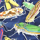
leafhoppers

A design of leafhoppers

I’ve had requests for more entomological designs and I found out about these wonderful creatures called leafhoppers. They’re like tiny, exquisitely coloured cicadas, and they come in a variety of fantastic patterns.

Screen Shot 2018-11-06 at 1.03.10 pm

the leafhopper pattern is available in both large and small sizes

I’ve decided to try something new with my upcoming fabric designs. For this design of leafhoppers (a relative of cicadas), I’m offering it in both a large (actual size of painting) and small size! My little hand is for scale because I didn’t think to have a ruler with me when I took a photo of the samples 🙂

They are also available on Redbubble, in large

rubusrepeat

My Rubus design, painted last year

Screen Shot 2018-11-06 at 1.11.04 pm

Rubus now available in a large size

Remember my Rubus design? I’m now printing it in a large size! Since it’s a very small painting in real life (that little thimbleberry is the size of my thumbnail) you get a loose, painterly look at a larger size, but I think it’s still very effective!

If anyone makes anything with my fabrics, or buys any of my homewares or products, I’d love to see the results!

Further Finland! Houses and sunsets

You might recall some of the striking photographs I uploaded of my time in Kristiinankaupunki. Well, I’ve continued to be inspired by my travel photographs, and have made some further paintings and drawings!

bothniansea

The Bothnian sea!

sunset housessmall

View from the attic window

sunset house blue & yellow

strange, twilight summer sunsets

These last three images are experiments in paint. I am a self-taught watercolour painter. As a consequence, there are several techniques I never quite learned how to do. Large scale washes and cloudy skies are one of those things. I figured it was time to try and get this technique down pat, using my photographs of the nordic summer as my inspiration.

Talot

houses of kristinestad painted in gouache

I don’t paint with gouache very much but I felt the flat colour worked very well to capture these little wooden houses. They’re such brilliant colours! I made this design available on Redbubble and on Spoonflower, so if you want to have curtains with little houses all over them, it’s within your reach!

LOUISA_GIFFARD1

a rushing river, rendered in ink

I had a lot of fun with the challenge of drawing this turbulent river, and its surrounding rocks and puddles with dip pens and a bottle of ultramarine ink.

GIFFARD_LOUISA_STOVEFOREST_WOODBLOCKPRINT

A forest stove, woodblock

GIFFARD_LOUISA_FORESTTRIANGLE_INTAGLIO

Another forest stove, etching

These last two images are prints that I developed when I was in Kristinestad, but wasn’t able to print properly. When I had the chance I ran them through the press at Megalo and they came out great!


Kristinestad/Kristiinankaupunki

I was lucky enough to spend June of this year in Kristinestad, Finland, as an artist in residence. It was an incredible, special place. Kristinestad is the only town in Finland to have never burned down, and so it’s full of cute wooden houses from as far back as the 1700s, all more or less intact, on the shores of the Bothnian sea, with the forest a short walking distance away.

IMG_6081fullsizeoutput_131fIMG_6409IMG_6090

I had an absolutely wonderful time going about the town and photographing all the beautiful old buildings in the never-ending summer light. The locals were also very welcoming, and were very excited to show me and the other artists their houses, the forests and the surrounding towns.

Before I left I was still working on the repeat textile patterns I’d started exploring around a year ago. The locals were delighted with my most recent design, Nuthatch Forest.

nuthatchesrepeatsmall

Nuthatches are “Pähkinänakeli” in Finnish, “Nöttvacka” in Swedish, which comes in handy when you’re in a bilingual town

(The nuthatches are also available on my Redbubble)

The first design I did in Finland was a design of tiled stoves in a little rainbow forest, drawing on the ubiquity of the masonry stove in rural Finland, and the wonderful varied forest landscape that fuels the stoves. It’s also now available as a fabric design!rainbowstovessmallIMG_6467

Masonry stove

A typical Finnish stove in a restored wooden house

Inspired further by the forests, and the light, I did a few smaller drawings, experimenting with technique. The first little landscape was drawn entirely with six different colours of pencil; the second, with six colours of pen. Kristinestadsketchbook

While it can be hard work, I like the effect created by the layering of different simple colours to create a complex range of hues and tones. On my return, I drew a picture of the river Aura in Turku, using five colours of ink and a nib pen, and I love the richness of the result. turkuriversmall

I’m often very frightened to do small drawings in my sketchbook. As a perfectionist, I wonder whether what I’m drawing will be any good, and I feel that people will leaf through, expecting finished masterpieces. When creating art it can be extremely stifling to be constantly worried about whether or not you’re creating a great work whenever you put pencil, pen or brush to paper. I need to remind myself that it’s more important to keep creating than to worry about the worthiness of my work before I’ve even made it. I put these most recent works on my Redbubble because I’m proud of them.

Finally, I created another textile design – jackdaws, in a field of flowers! 

kukkanaakatsmallest

Kristinestad has two things. First, a lot of jackdaws. These small squeaking birds are called Naakka in Finnish and I found them extremely endearing. Second, Kristinestad has a lot of flowers – not only in the kukkakaupat (flower shops), but also growing wild in the forest, in thick carpets of the most thrilling and vibrant purples, pinks and blues. IMG_6886

I loved the kukat, and I loved the naakat. Therefore, I felt I needed to combine the two of them into a repeat pattern. EDIT: My kukkanaakat are now available as fabric!

I had a wonderful time in Kristinestad, and I hope everyone reading this can go to this beautiful town one day too.

Birds, birds and whales

Last year I took part in a contest called Create Art History, held by the State Library of Victoria, held in partnership with Redbubble. The library provided inspiration material from their collection, and the task was to reinterpret the material into something new. I selected this image, called Sea Creatures, by Isaac Commelin  Sea creatures (Isaac Commelin) - State Library Victoria.jpg

Inspired by the sea creatures massing around the ships, as well as the engraving style, I decided on an elaborate ink drawing I called Leviathans. leviathans smallUnfortunately I failed to place in the competition (which seemed more focussed on photoshopping/image manipulation than my typical style of working) but I’m proud of the design anyway. It’s available on Redbubble for all those fans of whales out there.

Next, a design celebrating Australia’s diverse range of black and white birds – the Australian Raven, the Currawong, Australian Magpie, Magpie-Lark or peewee, and the White-Winged Chough

black and white birdsnbg

As a contrast to my slow careful nib drawing, this design was done quickly with ink and brush. It’s available on Redbubble

bird colour wheel nbgcrop.pngFinally, a bird colour wheel! I love the diverse and fabulous range of plumage colours in the natural world, and decided to…well, a bird colour wheel is relatively self-explanatory. The most difficult thing was curating the bird species. It turns out it’s fairly difficult to find bird species that are near-uniformly one bright saturated colour all over – but I found some appropriate species eventually! All the birds are painted in watercolour. This design is also available on redbubble.


Design a site like this with WordPress.com
Get started